

As a brand, your website is your resume. It’s a reflection of your professionalism, competence, and industry expertise. The GE shopper research study states that most people search for a brand online before buying a product from them, and it takes no genius to figure out where a person lands when they search for a brand online
Your website. This is how you make your first impression on the customer as a brand. The way your website looks and feels determines whether a visitor will stay and explore, or get bored and leave.
Most websites feel outdated and lack some modern elements that keep users engaged. Some of the common reasons are undiscoverable features, poor heading, bad CTA placement and poor visuals.
Now that we have established that improving the user experience of your website can significantly increase the conversion rate. The next step is to figure out what’s wrong with your website and how to fix it. So let’s shift our conversation toward that…
How to Improve your Website User Experience
Here are some tips that will help you take your website user experience to the next level.
1. Use Targeted Headlines
Your headline is crucial!
The first thing a user interacts with on your website is the headline. So, it is necessary to create a no-frill headline that even a five-year child can understand at first glance.
Additionally, each web page component has one distinct headline and a few supporting details, which makes the content easier to understand.
Every website should captivate visitors and speak loudly and clearly, about what it stands for through the headline. While drafting a headline for your website make sure to keep in mind these two points:
- Benefits that the product will bring to their life
- Problems it will solve for them
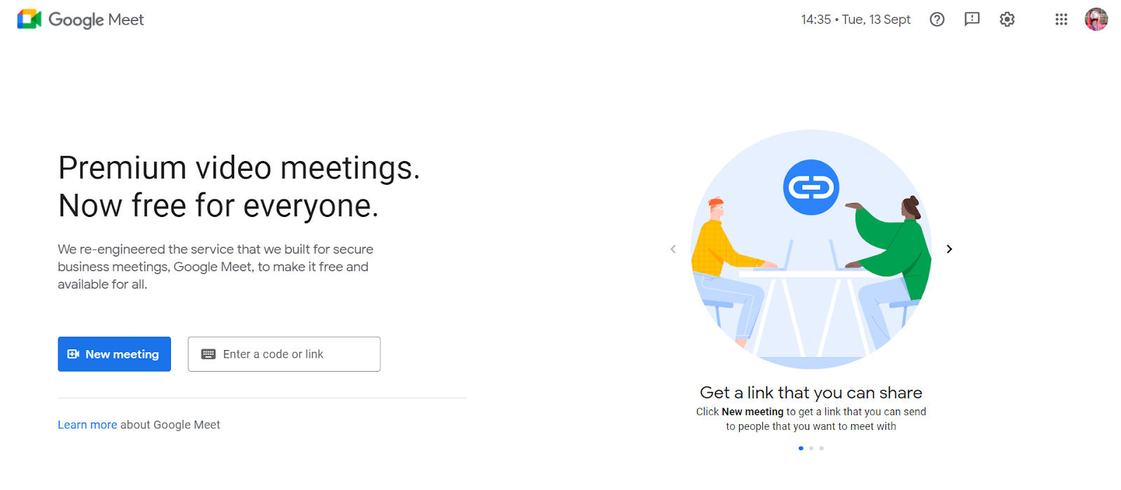
Google has one of the highest-converting websites and its headlines are sharp and precise. They use the right color and font combinations and effectively communicate their product features and their benefits with their headline. Google Meet has a really clever headline that attracts a lot of attention.
2. Make Your CTA Powerful
A CTA or Call-To-Action is an image or text that prompts visitors to take action. With your CTA, you can drive action on your website and direct your visitors where to go next, what to do, and what to buy.
CTA may vary depending on your target audience; for example, a travel agency may use a CTA that says “BOOK NOW” while e-commerce websites may use “BUY NOW” or “ORDER NOW”.
The CTA is the final destination for your client on your website. For instance, if a visitor lands on your website, skims through the entire content, and is now ready to take some sort of action on your website. But all your efforts would be in vain if there’s no CTA button to assist the desired action.
Now that you know the importance of the CTA button, Here’s a question for you!
Do you want to make a powerful CTA?
If yes, then here are a few tips to create a decisive CTA button that works perfectly to improve the user experience on the website.
2.1 Cut the Fluff
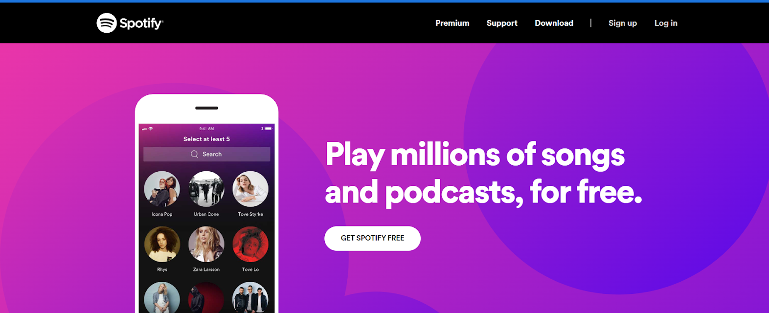
Make sure to separate your CTA from all the fluff on your website and make sure it is clear and rightly placed. Instead of stacking multiple CTA buttons right next to each other, make sure they are accurately spaced and placed in a manner that reduces confusion. You want to take the customer through the website in a way that is delightful and with good CTA placement, your customer won’t be overwhelmed by the amount of information on your website. One example is Spotify:
2.2 Use Action Verbs
You can add visual cues with an action-driven verb. Remember wording psychology will trigger visitors to act. So make sure you use bold, emotionally rich, and action-driven CTA. Action verbs create a sense of urgency in the user, and when used with the right colors that invoke appropriate emotions in the user, it boosts conversion.
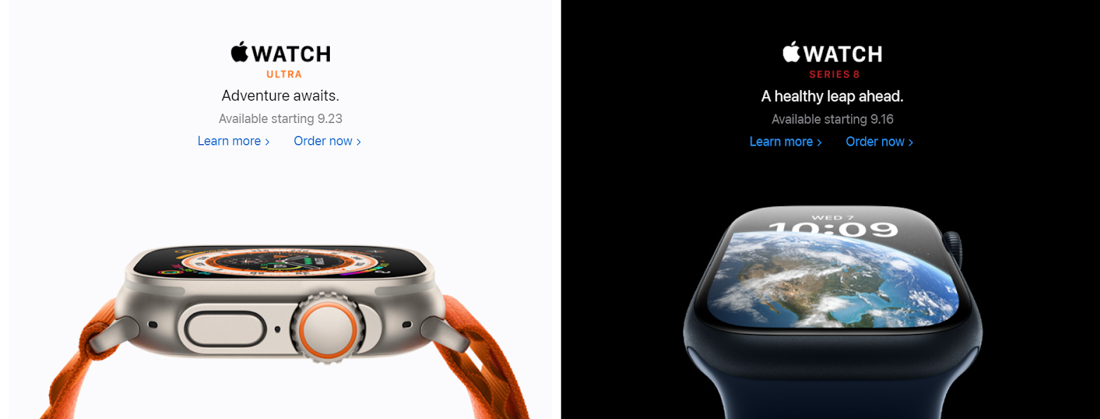
Take Apple, for instance, they are particularly good with the use of action verbs in their CTA buttons.
2.3 Use the Psychology of Colors
Another great way to optimize the conversion rate of your website is to use the psychology of colors. It’s a well-known fact that colors elicit emotions. And each color inspires a different emotion. For example, red inspires power and passion, blue inspires trust and peace, and green inspires growth and positivity. While choosing the color for the CTA button on your website, you should choose the colors that align with your brand image and invoke the emotions that you want them to feel while buying your product.
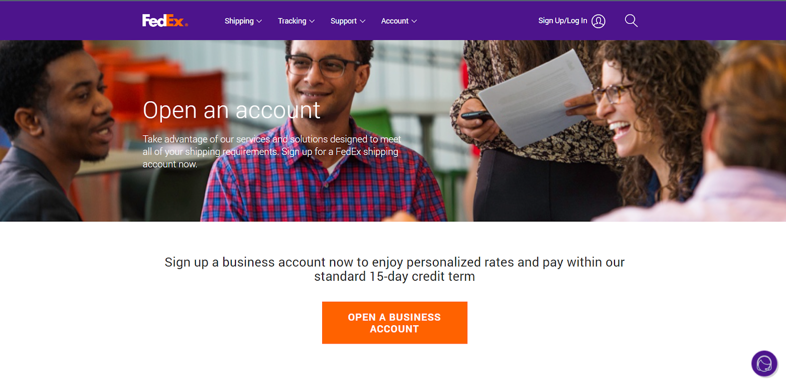
A great example to consider here is FedEx. Their brand colors are white and orange, and they have used an orange CTA button on their landing page. Orange elicits enthusiasm and excitement.
CTA is an important element to boost the conversion rate of your website among other factors. We have a detailed blog on how you can create a high-converting landing page for your brand.
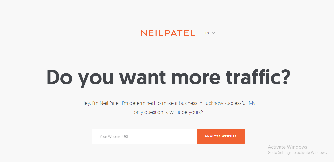
Take the example of Neil Patel’s website for instance. The entire web page’s CTA buttons are simple but filled with action-driven encouraging users to browse to the next page. Beautifully crafted action words with color games keep visitors engaged on the website.
3. White Space is Good
White Space referred to as “Negative Space” is the empty area surrounding a page’s content and functional features. White space doesn’t mean a white background, it can be any area that acts as a background for the content or practical features.
White Space is one of the most neglected and underused components that make up a great web layout. While there are people who consider white space on a website as a waste of screen space, that is definitely not true.
Did you know white space increases the attention span of visitors by 20% on the website and obliges them to linger for the long haul?
Apart from retaining visitors to the website white space has a few other advantages:
- Makes text easier to read.
- Drives user’s attention to particular objects.
- Creates a visual hierarchy and makes a page scannable.
- Makes the reader concentrate on what’s most crucial.
4. Assure Clear & Concise Website Navigation
If returning to the search engine is the simplest option for a user on your website there are some serious navigation issues you need to figure out. Moreover, it even implies users have a very short attention span and if they have to spend more time thinking about ideas to access the website rather than acting (which is most probably what they are looking for): you may lose a potential customer and reduce your conversion rate.
To get rid of the hopping visitor and increase the chances of conversion, you should use clear and concise navigation.
Here are a few pointers to make clear and concise website navigation.
- Be descriptive with the navigation.
- Show them what to do, where to do it, and how to do it.
- Limiting the number of elements on the menu, it might confuse the users.
5. Make Your Website Faster
Faster than light is not possible yet according to the laws of physics but you can at least match the average loading speed of 1.286 seconds for desktop and 2.594 seconds for mobiles.
Webflow and GoDaddy are the two fastest-loading websites with a loading time of around 0.2 – 0.3 seconds. Just click on the link and boom, everything is right there in front of you. No lag whatsoever. Now that’s how you make a first impression!
The user experience is negatively impacted by slow page load times and slow user action responses. Users may become impatient with waiting for material to load and eventually leave a website or application if they experience this, increasing your bounce rate (percentage of users hop to another website after viewing only one page).
Following a 50% reduction in website load time, retailer AutoAnything saw a 12–13% boost in sales. Even the BBC has discovered you can lose around 10% of leads for every extra second to load the page.
Now that you know the importance of website loading speed here’s an actionable tip to improve yours:
Compress all of your images before uploading them to your website to increase page performance as images take time to load and could affect overall loading speed. Moreover, you can use professional web builders and performance-oriented hostings.
6. Fix 404 Errors
I don’t know if it’s just me or everyone feels frustrated after they see an error 404 message after waiting for a page to load. It’s a disappointing experience to have nothing on a webpage that you waited for so long to load. Although it might not be as frustrating for everyone, it surely leaves a bad impression on the user. And a bad impression doesn’t help much in increasing the conversion rate of your website.
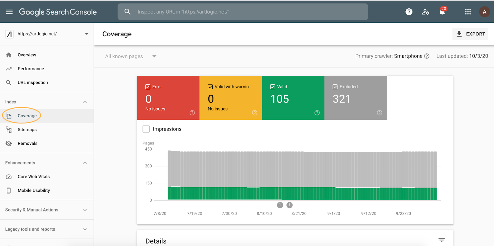
The most resourceful tool is Google Search Console, which indexes your website and provides statistics of errors and issues on the website. You can access errors on the coverage tab as shown in the image below.
7. Think Mobile First
On average 50% of all the web traffic comes from mobile. Because of advancements in mobile technology and convenience, most users prefer mobile phones and compact devices for web surfing.
Google indexes your website using both its desktop and mobile crawlers as a result, having a mobile-friendly website can help you perform higher in search engine results and increase visibility.
8. Images are Worth More than Words – Use them Wisely
Images are more than mere decoration, they can make or break a user’s experience. Every image tells a tale. It’s best if you know what you want to say before you start, just as when you write. Though not all images enhance the experience, compelling images have a special capacity to move and captivate your audience.
Do you know which is perfect for your webpage?
If you don’t, here are a few pointers you should consider to choose the right images for your website:
- Don’t oversaturate your website with images. Sure, images enhance the visual experience, but using too many of them can have the opposite effect.
- Avoid using low-quality images. It looks highly unprofessional. Make sure the images have the right aspect ratio and high pixel density.
- Use your original photographs that reflect your staff, brand, and services if you’re looking for a more relatable human connection.
9. Keep it Simple
Today, many websites merely require the first name and email address for a signup, making the process a cakewalk.
Visitors will bounce from the website if you start requesting more information. Remember that most online users don’t have the time to complete long forms because we live in a fast-paced society. Ask simply for the information you require as a general rule.
For instance, creating a new account on Netflix is a piece of cake. Just put your email, create a password and choose the plan, and it will redirect you to the payment page. Complete the payment and now you are ready for Netflix and Chill.
Bonus Tips
Add Customer Testimonials
Customer testimonials are the best approach to increasing engagement on a web page, since people are social creatures at heart, and when they see other people using and enjoying a product, their confidence in it grows and all of their reservations go away.
Skimmable Content Works Better
The audience is always busy, and you need to value their time. You can make a long-form blog skimmable by adding bullet points, changing the format, and using infographics. Similarly, you can optimize the content on your homepage to make it more scannable and easy to consume.
Another strategy is to place a summary around the page’s top or bottom. It is important if you want your webpage to solve a problem. Because there might be users who don’t need any more convincing and are there to act.
Ads Should Not Overpower Your Content
Monetizing your website can be a good revenue source, but don’t overuse it. If a user spends time scrolling and taking precautions with multiple ads, they’ll get frustrated and leave your site.
Even ad placement matters in the overall user experience, so I would suggest you reserve a white space specifically for ads.
Things to Avoid for a Better User Experience
- Keyword stuffing for better SEO rank is a myth. Websites need to be SEO-friendly but keyword stuffing won’t work. Instead, improve content quality to improve your rank.
- Never feed incorrect information to audiences, it’s unprofessional and reduces your trustworthiness.
- Inconsistency with text font, color, alignment, and size will motivate visitors to leave the site.
TL;DR
User experience is one of the most prominent factors for better positioning in the market. But most websites fail in giving a good user experience which results in loss of traffic and negatively impacts the sales figures. Here are a few tips you need to consider for providing a better user experience on the website.
- Optimize your site speed and make your website mobile friendly.
- Keep clear and concise website navigation.
- Use white space with catchy headlines and proper font alignments.
- Never overdo advertisements.
- Try to avoid 404 errors and keep updated with Google recommendations.
- Use high-quality images to enhance the visual experience of the users.
- Never let visitors leave the website without performing any action – use nicely placed CTAs.